
Brand · Visual identity
Visual identity is not a matter of taste
Choosing a company's identity based only on personal taste is to assume the audience will feel the same. That is how preference replaces evidence.
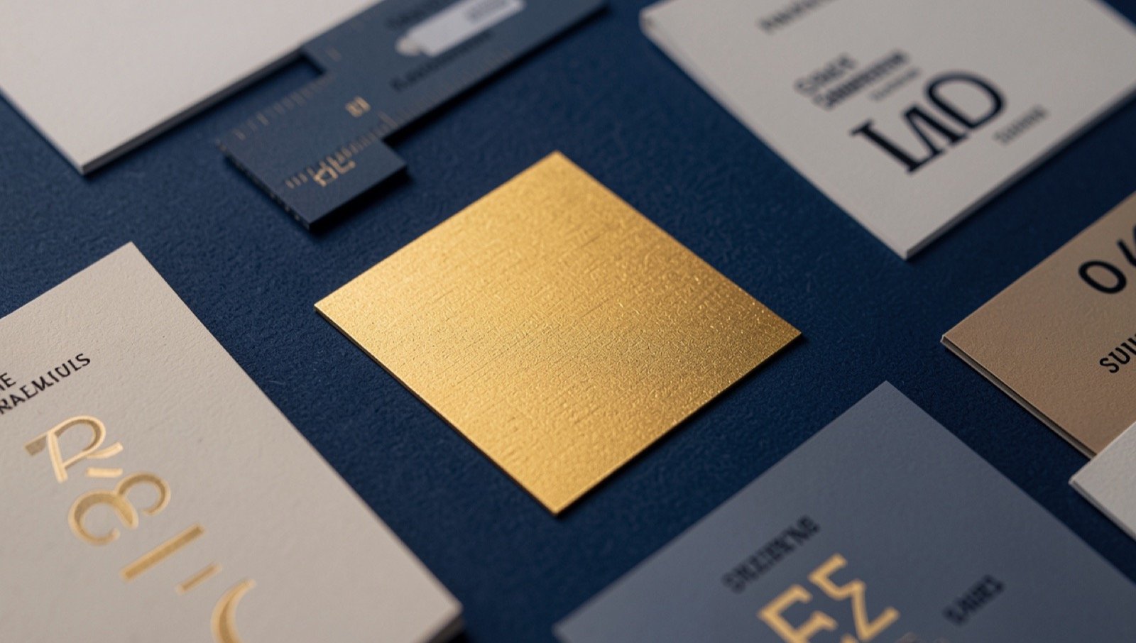
There is a question that ends many brand meetings: “Do you like it or not?”. It is a valid question, but it should not guide the decision. A company's identity does not exist only to please those who approve it internally, it also exists to convey a clear, coherent image suited to the audience it intends to reach.
Why taste, on its own, is not enough
Research on dual processing distinguishes autonomous processes, which tend to produce initial responses, from higher-order reasoning processes, which depend more on working memory and allow different possibilities to be considered (Evans & Stanovich, 2013).
This distinction does not mean that all decisions are irrational or exclusively emotional. It means that not all judgments begin with a detailed, conscious analysis.
On contact with a brand, a person may quickly form an impression of modernity, competence, closeness, trust or disorganization, before carefully analysing the arguments presented by the company. Later reflection may confirm, correct or reject that first impression, but it does not remove its importance.
This is why the preference of whoever approves internally does not, on its own, constitute evidence that the identity will produce the intended effect on the audience.
What pleases the board, the founder or the team may coincide with the market's perception, but it may also not coincide. The only way to reduce that uncertainty is to confront internal decisions with information gathered from the people the brand intends to reach.
An internal preference is an opinion. It becomes a strategic decision when it is confronted with data.
Emotion takes part in the decision
Emotion should not be presented as the opposite of reason. The two processes interact in the evaluation of alternatives and in decision-making.
In a classic study, Bechara et al. (1997) observed that affective signals began to steer participants toward more advantageous choices before they could consciously explain which strategy was best. These results support the idea that certain emotional responses may contribute to the decision before an explicit line of reasoning is formulated.
This does not mean that the consumer always buys unconsciously, nor that a given colour inevitably provokes the same reaction in everyone. It means that the elements of an identity can take part in forming impressions that precede a deeper analysis.
Colour, for example, can contribute to the brand's perceived personality. Labrecque and Milne (2012) showed that different colours can favour distinct associations, such as competence or excitement. However, those associations are not universal: they depend on the context, the product category, the culture, prior experiences and the combination with the remaining elements of the identity.
Typography also communicates. The formal characteristics of a typeface can convey impressions related to strength, elegance, closeness, formality or innovation. Henderson et al. (2004) showed that typography influences the perceptions formed about what is presented and that its suitability depends on the impression one intends to convey.
For that reason, at Núcleo Parceiro, colour and typography are not chosen simply because someone “likes them more”. They are treated as signals of communication. The decision must consider the intended positioning, the audience, the competitive context and the data gathered during the research.
We do not assume a visual element will automatically produce a response. We formulate a hypothesis about the intended effect and seek to support it.
The first impression forms quickly
The speed of visual perception reinforces the need for coherence.
Lindgaard et al. (2006) found that people could form a relatively consistent appraisal of the visual appeal of web pages presented for only 50 milliseconds. The study does not show that a purchase decision or a relationship of trust is concluded in that interval. It shows, however, that visual appraisal begins very early.
Before reading the value proposition, learning the organization's history or examining the services, the visitor has already been exposed to the structure, the colours, the typography, the visual balance and the organization of the information.
That first impression can be revised, but it is the gateway to everything that comes after.
An effective visual identity does not replace the company's quality. Nor does it make up for a weak service or a promise the organization cannot keep. Its function is to allow the company's real value to be perceived with greater clarity and coherence from the first moments of contact.
The NP way: a rigorous process with a creative output
What sets the Scientific Method of Brand apart is not only the visual result. It is the path taken to reach that result.
The conclusion is creative; the path is grounded.
Organizational Immersion makes it possible to understand the company's reality, its culture, its processes and what it can sustain.
Opinion Research gathers information from the real audience, complementing the reliance on internal impressions.
Competitive Benchmarking situates the company against existing alternatives and identifies patterns, similarities and opportunities for differentiation.
Visual Architecture turns that information into decisions about colour, typography, composition, language and the remaining elements of the identity.
Each stage has a function. The client does not receive merely a preference presented convincingly. They receive a conclusion that can be explained, discussed, defended before the organization's decision-makers and, when the project allows, tested with the audience.
When someone asks why the brand ended up this way, the answer should not be “because we like it more”. There must be a justification related to the intended perception, the data gathered and the company's strategic objectives.
That is the difference between an aesthetic choice and a grounded decision.
If your company's identity was decided by taste, it is worth asking what it communicates to those who do not yet know it. The first step is not to budget a redesign: it is to confront internal decisions with the audience the brand intends to reach.
Book a Strategic ListeningSources
Each study cited in this article was verified in the primary source. The readings follow what the authors concluded, without going beyond it.
- Bechara, A., Damasio, H., Tranel, D. & Damasio, A. R. (1997). Deciding advantageously before knowing the advantageous strategy. Science, 275(5304), 1293-1295. Source
- Evans, J. St. B. T. e Stanovich, K. E. (2013). Dual-process theories of higher cognition: Advancing the debate. Perspectives on Psychological Science, 8(3), 223-241. Source
- Henderson, P. W., Giese, J. L. e Cote, J. A. (2004). Impression management using typeface design. Journal of Marketing, 68(4), 60-72. Source
- Labrecque, L. I. e Milne, G. R. (2012). Exciting red and competent blue: The importance of color in marketing. Journal of the Academy of Marketing Science, 40(5), 711-727. Source
- Lindgaard, G., Fernandes, G., Dudek, C. e Brown, J. M. (2006). Attention web designers: You have 50 milliseconds to make a good first impression! Behaviour & Information Technology, 25(2), 115-126. Source